
Presenting Data
To demonstrate the variety of chart types available in Excel, it is necessary to use a variety of data sets. This is necessary not only to demonstrate the construction of charts but also to explain how to choose the right type of chart given your data and the idea you intend to communicate.
Chart Creation
To create a graphical representation of a set of data:
- Highlight the range (continuous or non-continuous)
- Go to the
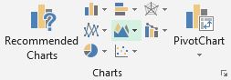
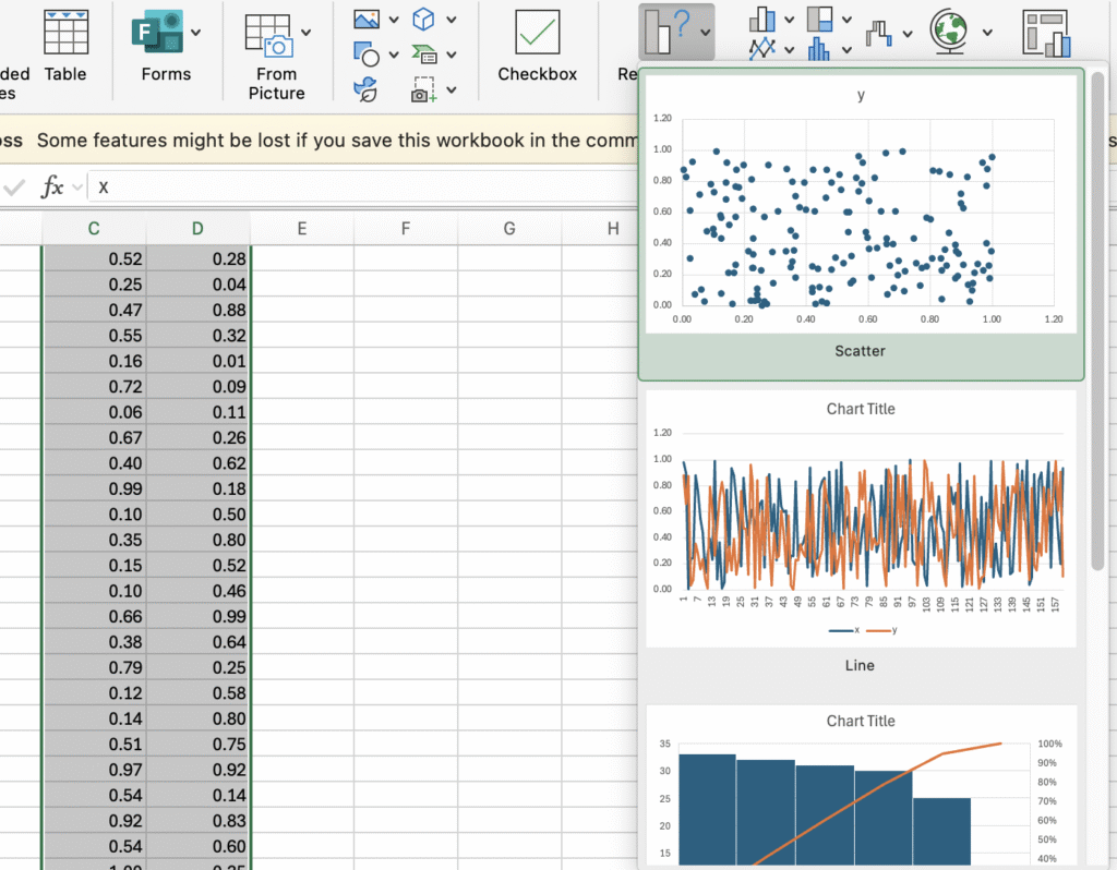
Inserttab on the ribbon and choose a chart type from theChartsgroup. - Select Recommended Charts.
- Select a chart on the Recommended Charts tab, to preview the chart.
- Note: If you don’t see a chart you like, select the All Charts tab to see all chart types. You’ll see common types like Column, Line, Pie, Bar, Area, Scatter (XY), Stock, Surface, Radar, and Combo charts (a combination of two types).
- Select a chart.
- Select OK.
- The chart will appear. You can move and resize the chart how you want.
Graph Titles and Axes Labels
Under Chart Design > Chart Element, you can edit the graph’s fields. Quick Layout will show you preset layouts that could include a Chart Title, Axis Titles, Legend, etc. The Add Chart Element will allow you to add items to the graph individually.