Measurement Units
For visual design of a webpage, the ability to define distances and colors on the screen is needed. Units of measurement on the web are diverse, but the most commonly used units are detailed below.
Colors
Modern computer screens are capable of displaying 24 bits of color, or 224 different colors. CSS can make use of all of these colors. Rather than coming up with 16,777,216 names for all these colors, we can specify them with hex codes.
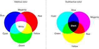
Computer screens create color by mixing varying amounts of red, green, and blue light. Combining them in different intensities creates the illusion of different colors. For example, black can be thought of as zero red light, zero green light, and zero blue light; white, on the other hand, is lots of all three colors of light. Any color that the screen can display can be specified as a mixture of just red, green, and blue light. This is called an additive color system.
The mixture is represented as three bytes: one byte for red, one for green, and another for blue. Recall that a byte can have a value between 0 and 255. Rather than specifying them as a triple of decimal numbers, each byte can be conveniently represented exactly as two hexadecimal digits. We discuss hexadecimal and bytes in the section Hexadecimal.
CSS uses hex to specify colors. They begin with a hash followed by six hex digits. The first two hex digits (a byte) represent the red intensity, the next two represent green, and the last two represent blue: #rrggbb. For example, a bright red color can be thought of as full red intensity with zero intensity green and blue, thus #FF0000. When red and green light are mixed, the result, #FFFF00, is yellow.
If all three bytes are zero, then the pixel will be black; if all three bytes are 255, then the pixel will be white.
For a comprehensive list of hex colors and their names, refer to Wikipedia.
Distances
Due to the wide variety of web-enabled device displays, all with different physical sizes and pixel densities, distances are a little more difficult to measure on the web.
The most literal way of measuring distances is by using the pixel unit. In css, a pixel (short for picture element) is a unit of distance based on a mathematical approximation of the smallest dot a computer screen can display. This means that, even on two laptops that have a 15-inch screen, a pixel might appear smaller on one than the other if the first screen had a higher display resolution. Pixels are considered appropriate for resizing (or adjusting other properties of) any elements on a webpage: text, images, etc.
A pixel is a small addressable dot on a computer monitor that can be set to a requested color. One of the important properties of a monitor is its resolution, which is a measure of the dimensions of a monitor expressed in pixels. For example, a resolution of “1280 x 720” is describing a monitor with 1280 pixels across and 720 pixels down (for a total of 921,600 pixels). Other example resolutions are 2048 x 1152 and 4096 x 2160 (thus the name 4K TVs).
Another commonly used unit of measurement is the percentage unit. The percentage unit is based off of the containing element’s font size (or the browser’s default font size, if no font size is defined for the containing element). This means that if a user has changed their browser’s font size, elements which are measured in percentage may scale as well . Because the percentage unit is so closely coupled with font size, it is not appropriate for resizing elements other than text (for example, giving an image a width of 200% will not cause the image to be twice as wide as it was).
Similar to the percentage unit is the em unit. One em approximates the width of the letter ‘M’ (the widest character in the English alphabet) in the font size of the containing element (or the browser’s default font size, if no font size is defined for the containing element), although the actual measurement is slightly larger than that. Like the percentage unit, this can cause scaling if the user has adjust the browser’s default font size. This unit of measurement has a historic relevance in the typesetting industry and is still quite popular in the digital age. Because the percentage unit is so closely coupled with font size, it is not very appropriate for resizing elements other than text.
For more information about measurements of distance on the web, review the W3C formal definitions, or search for any of the many blog articles written by web developers which discuss the relative merits of each type of unit.